What are you seeing?
In-line images and symbols, reminiscent of old chain letter text messages or everybody’s favorite ’90s font, Windings, are back and breaking into branding. The most common version of the trend, which we’re calling Nouveau Rebus, uses dingbats or emoji-like symbols sandwiched in between words, but rebus content can take the form of everything from geometric shapes to illustrated fruit stickers.
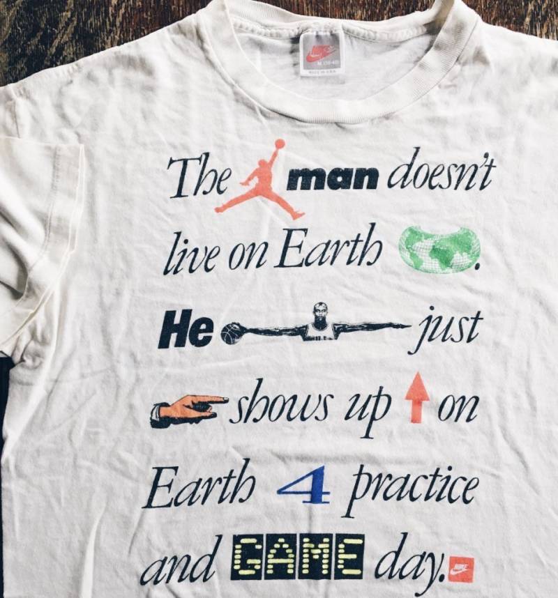
The design approach is named for its similarity to the Rebus, a style of word puzzle that combines illustrations with individual letters to depict words or phrases. Printer’s ornaments have a long-standing history of filling empty spaces in printed matter, with this particular motif of in-line drawing being seen as far back as documents from 17th Century Germany—though to many graphic designers, the most familiar historic example will likely be Paul Rand’s classic IBM graphic made of an eye, a bee, and the letter M (or, for those who like a deeper cut, Herb Lubalin’s work for Fact or this 1980s Nike shirt).
In the rebus’ newfound iteration, images aren’t used as replacements for words or letters; instead, these supplemental graphics replicate or add additional context to written copy. Semiotically, the interloping content can be an aesthetic or decorative swap (like substituting the letter A for a graphic pyramid) or more conceptually linked; for instance, where a word like “happy” is followed by a smiling sun.
If we stretch our boundaries a bit, the Nouveau Rebus definition could also include the growing sub-trend of alternative typographic styles used together in one line for emphasis; whether that be a single word rendered in a pop color, capitalized, or italicized, or the use of decorative in-line buttons, superscripts, and annotations.
Who’s using it?
In all honesty, you’d be hard pressed to find a design studio that hasn’t used a Nouveau Rebus in one way or another over the last two years. But, to be a bit more specific, the design tactic is most popular in direct-to-consumer style identity work at the moment. It doesn’t seem to have a monopoly on any one industry or organizational scale, and has been used for food, tech, wellness, beauty, music, fashion, and publishing, as well as by large corporations (even Google!) and smaller bespoke brands alike.
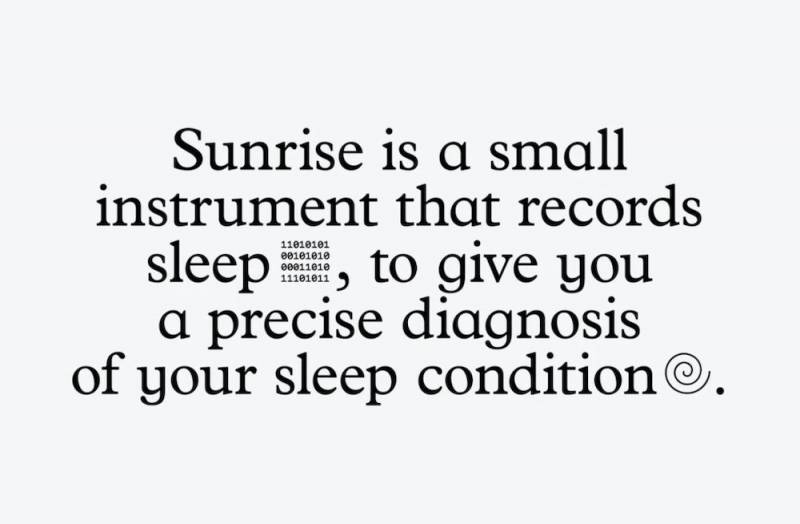
Outside of Paula Scher’s redesign for Library of Congress in 2018, two of the earliest rebus use cases for a commercial brand seem to be Heydays’ 2019 work for Aurlands, a Norwegian shoe brand, and Base Design’s work for Sunrise, a sleep tech product, in early 2020. In both systems, the rebus style follows a fairly classic approach, with in-line symbols rendered in a similar weight and style as text, almost as if the icon and letter glyphs were all found within the same typeface. As the trend spreads, however, designers seem a bit more inclined to push for contrast between text and image: RoAndCo’s identity for Bala and Zero’s for Maev both use silhouetted objects in between lines of copy, while Order’s work for Songtrust and Porto Rocha’s for Upwork utilize portrait photography.
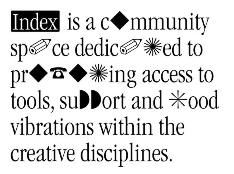
Notably, the style is so beloved by designers that it can also be found in a growing number of identities that creatives and design studios have made for themselves. One example is the rebrand of Index (FKA XXXI), a community center in NYC that offers peer-led workshops, books, and events to the creative public. In their new identity system, the letters i, n, d, e and x are set in Garamond Condensed (see the last Spotted piece on the 1980s for more on the Garamond resurgence), while all other letters of the alphabet are replaced with dingbats, some classic and some custom.
