


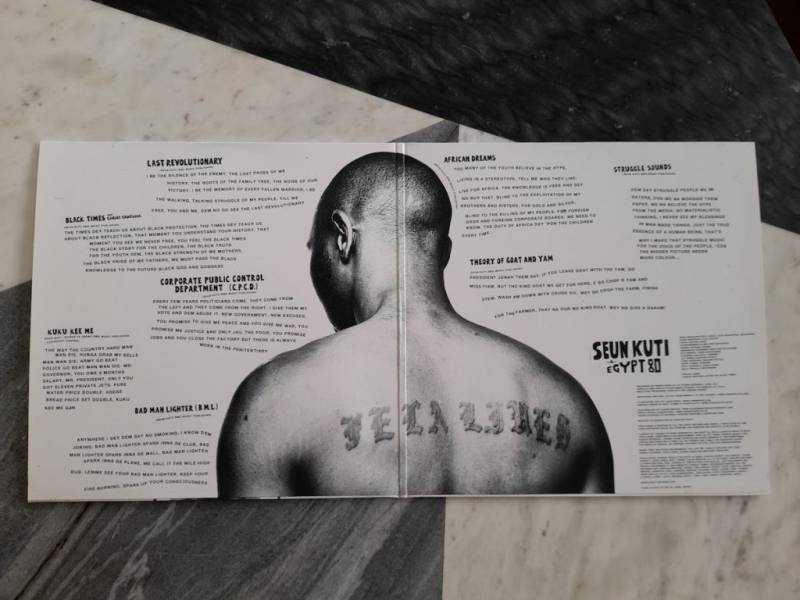

If ever tangible proof were needed that Fela Kuti’s legacy lives on, look no further than his youngest son Seun Kuti’s back tattoo. The words “Fela Lives” have been inked into the musician’s skin in giant letters to ram home the point. But you’d hardly need convincing of family ties by listening to Seun’s music. His father was the father of Afrobeat, and he and Egypt 80 — the band that sustained Fela until his final album in 1992 — are still keeping the flame alive.
It was artist Lemi Ghariokwu who largely forged Fela Kuti’s visual identity. He is responsible for 29 of the Nigerian legend’s 56 album sleeves, and has created more than 2,000 album covers in his lifetime. Failing eyesight has curtailed his output, though his style is just as enshrined in his legacy as the music. For those graphic designers working on subsequent Kuti descendents’ album artwork, it’s therefore become something of a quandary whether or not to reference Ghariokwu’s creations.
“The idea of legacy is as much forward-looking as retrospective, so pastiching the past was never a temptation,” says Joseph Durnan, senior designer at Ninja Tune, who worked on the 2021 Femi Kuti and Made Kuti joint double album Legacy+ (Femi is Fela’s eldest child, and Made his grandson). “I’d worked on a merch collection for Fela Kuti in the past using Bernard Matussière photography and elements of Lemi’s work, so in a way, I’d already had the opportunity to celebrate the history of the Kuti family via that project. So for this, it was very much about the present and future.”
Matt Thame of Studio Auto, Strut Records designer, also wanted to move away from Ghariokwu’s style in his cover for Seun Kuti & Egypt 80’s 2018 Black Times. Instead, the cover image referenced both the Black Panthers and police photofits: “Lemi’s approach was perfect for the Fela artwork of the time,” says Thame, “and while his work had a strong socio-political message as well, this was a fresh new release, and so deserved to stand out from previous artwork — it needed to capture the feel and direct power of the Black revolutionary.”
Lemi Ghariokwu met Fela Kuti at the latter’s Kalakuta Republic compound in Lagos in 1974, when he was an 18 year-old student. He’d become interested in making album artwork the year before, when he’d been captivated by one of Roger Dean’s Yes albums. For four years, Ghariokwu illustrated for the prolific Kuti every day: his busily imagery-strewn paintings splurged with vivid colors, and his darker, satirical collages were both an evocation of Fela’s thought processes and representations of his lyrics. “I am embellishing his point of view and adding my perspective,” Ghariokwu told The Guardian last year. “I am visualizing the soul of the music.”
Meeting Fela Kuti was an “eye-opening experience”, according to designer Lemi Ghariokwu, who was designated with the job of creating all of his artworks as soon as the pair met. The relationship handily coincided with Fela’s shift from highlife jazz to a new genre he created with the help of Tony Allen…
Lemi Ghariokwu, speaking to The Vinyl Factory: “I believe in predestination. I met [Fela] at 18, but I was prepared for the role I eventually played with him because I already had my African consciousness. We became like family immediately. This was my first ever chance. I came up with my cover art and it’s instructional in the sense that it signalled what I was going to do eventually on his covers. It was the first time in Nigeria that when the album was released, they rave-reviewed the music, and they also reviewed the album cover art too. That was the beginning of the dynasty of album cover art.”
LG speaking to Okay Africa: “Alagbon Close laid the foundation for what I was going to do for Fela through the years. I didn’t illustrate his lyrics literally in my cover artwork, but showed my own take on what Fela was trying to express. My art was a supplement to the music. It was a bit spiritual. For me, the album cover expresses the victory of good (Fela) over evil (the police). The whale capsizes the police boat, so nature helps Fela defeat them. On the left, Fela’s house Kalakatu Republic is standing on solid rock and the police jailhouse is on fire on the right. When Fela saw the cover, the first thing he said was, ‘Wow, God damnit!’”
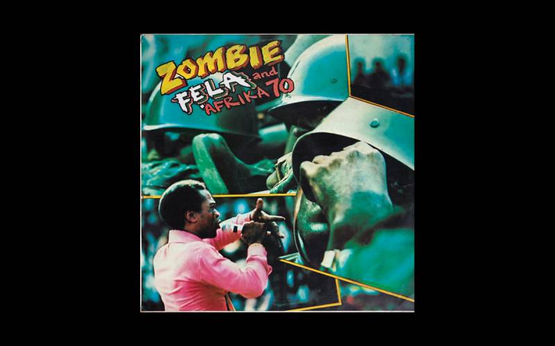
Fẹla And Afrika 70 — Zombie (1977)
Kuti agitating didn’t start with Fela: his mother, Funmilayo Ransome-Kuti, was a suffragist, human rights campaigner, and chief. The recording of Zombie — which compared the army to mindless machines, as well as the provocative collage on the sleeve — so incensed Nigerian authorities that they raided the Kalakuta Republic compound, set it on fire, and threw Funmilayo from a window. She died the following year.
LG, speaking to CNN: “Zombie is a tricky one, a troublesome cover. The song itself is trouble, big trouble, and was part of what led to the burning of Fela’s house. It took me a while to make the cover — I wanted to illustrate but my spirit wasn’t following and I couldn’t come up with a direction to give my illustration. But one afternoon I got to Fela’s place and there was Tunde Kuboye, the photographer and cinematographer husband of Fela’s niece. He had with him a box of pictures, hundreds of photographs taken at the military parade for Nigeria’s Independence Day on October 1. He just placed them on the ground for Fela to see.
“As I was looking at the pictures my spirit said to me, ‘this is album cover material!’ I chose about a dozen pictures from the collection. I remember as I was editing a number of pictures to fit my album cover square size, those three pictures fell within my drawn square like in an Ifa priest’s divination. I quickly used masking tape to hold them down in that divine movement, applied my Cow Gum adhesive and cut out the overlaps! I then finished up with thick brush lettering… Fait accompli!”
Fela Anikulapo Kuti & Egypt 80 — Beasts of No Nation (1989)
Fela almost inevitably fell out with Ghariokwu, though they were reunited occasionally for one-off artworks, including the very political Beasts of No Nation in 1989, a figurative and brutal work that Ghariokwu rates as his very best.
LG, speaking to Okay Africa: “Having worked on Fela’s album covers since the 70s I had left a mark, and was called on for some very important cover art statements when the need arose; Beasts of No Nation was one of them… I depicted Mobutu Sese Seko of Zaire, Mohamed Buhari, and Tunde Idiagbon of Nigeria, P.W. Botha of South Africa, Ronald Reagan, and Margaret Thatcher of the US and UK respectively with horns and fangs because they all belong to the same category as expressed in the song. People generally, and most especially in the UK, were critical of Margaret Thatcher at the time. She was actually nicknamed the ‘milk snatcher’ [Thatcher did away with free milk for children when she was education secretary]. The first ecstatic response I got was from Fela and [his brother] Dr. Beko Kuti. The Punch newspaper was first to publish an exclusive image of the cover art. Beasts of No Nation is one of my most rated Fela covers globally. I have never received a negative response to date. I just think the art speaks for itself; one can never run away from the truth.”
Seun Kuti & Egypt 80 — Black Times (2018)
The black beret, the Fidel-like cigar, and the photofit altogether make for a strong image that evokes freedom fighter and renegade, made all the more striking by the absence of text.
Matt Thame: “The original photos were all in color, supplied by Alexis Marion. I removed the color and reduced to black and white, pushing slightly in contrast. You can clearly see the references: Black Panther hat, Castro, and Malcolm X. I wanted the artwork to have a real, physical quality, so I printed out the photos, cutting and assembling them as per a classic ‘photofit’. At first I added additional elements of photofit data, utilizing interesting reference codes and numbers that might be seen, but in the end I brought it back. It was created in InDesign, and I experimented with digital manipulation, splicing and glitching the collage until the end became about the subtle imperfections; a bit of grit, misalignment, and difference in scale… and you’ve got to love that cigar!
“The hand drawn/cut display font was created by Lewis Heriz; we’ve worked on lots of each other’s projects over the years, including Sun Ra. All the rest of the layout was me playing with Helvetica Bold, and continuing this move away from purist photofit authenticity. I wanted the typography to move and flow around the striking, gritty photographs. The final product came with the name and title on a small sticker, which was removed once opened — a strong and brave cover with no type, just the faces to remember and the associations that come with it.”
Femi + Made Kuti — Legacy+ (2021)
A split double album between Fela’s eldest son Femi Kuti, and Femi’s son Made Kuti, opened up Fela’s grandson to a bigger audience and consolidated the dynastic intentions of this remarkable musical family.
Joseph Durnan: “The main focus was creating a level of equality between the two albums, looking at folding techniques; top opening so each artist had their own spine, and a folding gold foil sticker that wrapped around each side. Every decision was made to create a balance between the two projects.
“The portraits on the cover are paintings by Delphine Desane. I did some prep work for print and a little color grading, but they’re pretty much as she painted them. What’s great about the portraits is the strength of the colors, the sun and moon signifiers for Femi and Made — there was already a level of balance and distinction to work with. I wanted to keep that throughout the package — the opposing blues and reds, similar tones but contrasting identities — so there’s a harmony without removing anything from either artist.
“The main jumping off point was Delphine’s paintings—they helped inform a lot of the decisions, then the focus on the exact 50/50 ratio of each project within the package. The loosest part of the design was the typography, which was inspired by signage from The New Afrika Shrine near Lagos — hence the contrasting yellows/gold, hand-painted, and the block poster-style font for lyrics booklet.”


")