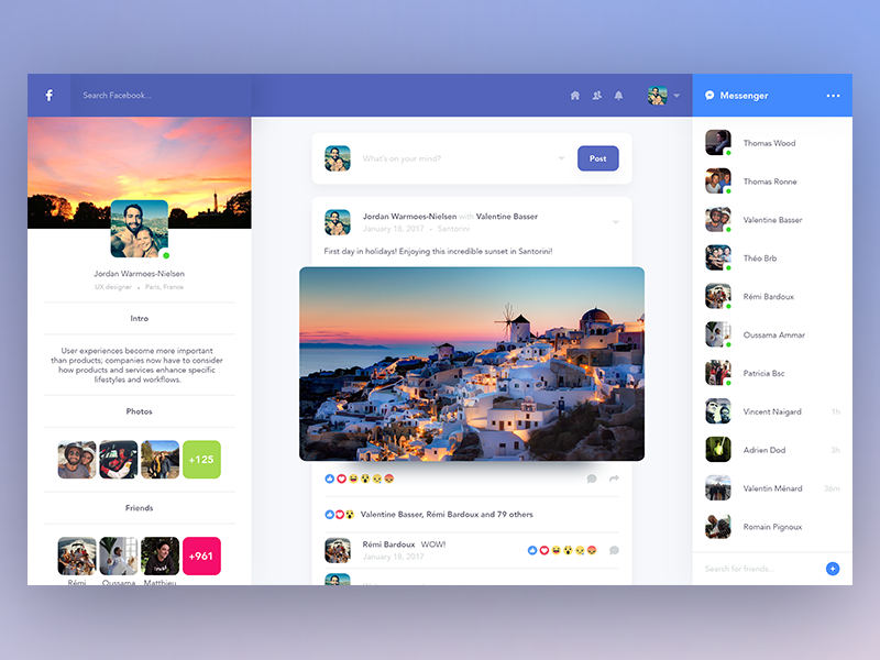
On the desktop version of the platform, nearly all of the navigation components, menus, and settings were relocated to the left, leaving almost no navigation at the top of the page.
I'm not sure whether I opted in for this, but I can't seem to find a way to turn it off, so this is how my Facebook experience looks right now. With the help of a wizard, Facebook explained what's new. "We consolidated all of your navigation options into one location," it explained. "With this update, you'll have access to everything you need on Facebook, including your profile, search, alerts, and messages."
The digital assistant pointed out the 3x3 grid button, which leads to a big "complete menu" that appears to contain every Facebook option under the sun. Beneath it, there are shortcuts (in my case, a single shortcut for Facebook's Watch video offering), and even lower, shortcuts to some of my groups.
It's been almost exactly two years since Facebook launched its last major redesign, which included a big change in the site's navigation, a cleaner look (with nearly none of the company's favoured blue color to be seen), as well as the optional dark mode. It was a major change, and it took some getting used to, but it was a much-needed overhaul of the over-cluttered Facebook of old.
This new change is disorienting. I use Facebook a lot, and not having that Home button (it's replaced by the Facebook logo button on the top left) short-circuited my brain every time I needed it. It's also hard to get used to having absolutely nothing on the top right, where some of the most important features and options (including Notifications and Messenger) previously were.
Every big makeover, such as this one, necessitates some tweaking, and everyone will react to the changes differently. However, certain aspects of this design don't appear to have been thoroughly thought through. I'm no UI/UX expert, but having two columns of menu buttons on the left, next to one other, feels clunky and cluttered, especially with so many vivid icons vying for your attention.
In the lower right corner, one major navigation button – the one for creating a new Message — is also left fully alone for some reason. Side note: the Message button starts composing a new Messenger message, but it's incomplete at this time, with no options for who I may send it to.
Having the majority of the navigation and options on the left is commonly seen in web design; Twitter and Gmail both have a similar look. Facebook, however, has a vast amount of options, features, buttons, and shortcuts, and placing all of them on the left might not be the ideal solution.


