Colors have minds of their own. They keep secrets and hide shady pasts. Every color we encounter in a great work of art, from the ultramarine that Johannes Vermeer wove into the turban of his Girl with a Pearl Earring to the volatile vermillion that inflames the fiery sky of Edvard Munch's The Scream, brings with it an extraordinary backstory. These histories unlock surprising layers in masterpieces we thought we knew by heart. This fascinating and forgotten language that paintings and sculptures use to speak to us is the subject of my new book, The Art of Colour: The History of Art in 39 Pigments. Color, we discover, is never what it seems.
Consider, for instance, Prussian Blue, the captivating hue that unexpectedly connects Hokusai's The Great Wave off Kanagawa, 1831, with Pablo Picasso's The Blue Room, 1901. Had it not been for an accident in an alchemist's lab in Berlin in 1706, such works, and countless others besides those by Edgar Degas and Claude Monet, would never have pulsed with such enduring mystery or power. It all started when a German occultist by the name of Johann Konrad Dippel bungled a recipe for an illicit elixir that he believed could cure all human ailments. Born in Frankenstein's Castle three decades earlier, Dippel (who, some suspect, inspired Mary Shelley's Doctor Frankenstein) was about to discard his botched brew of soggy wood ash and bovine blood when the dye-maker with whom he shared his workshop suddenly stopped him.
Fresh out of the scarlet dye, the color-maker grabbed Dippel's rejected solution, chucked in a few fistfuls of crushed crimson beetles, threw the pot back on the fire, and started stirring. Soon, the two were staring with astonishment at what was bubbling back at them in the cauldron: nothing remotely red at all, but a deep shimmering blue that could rival the resplendence of ultra-expensive ultramarine, which for centuries had been prized as a precious pigment far dearer than gold. It wasn't long before artists were reaching for Prussian Blue (so christened after the region of its serendipitous concoction) with both hands, lacing their works with fresh levels of mystery and intrigue. This is the thing about color: it never forgets. Just as the etymology of a given word can augment our reading of the poems and novels in which that word appears, the origin of color shapes the meaning of the masterpieces in which it features. Invented by Stone Age cave-dwellers and savvy scientists, seedy charlatans, and greedy industrialists, the colors that define the works of everyone from Caravaggio to Cornelia Parker, Giotto to Georgia O'Keeffe, vibrate with riveting tales. Although Van Gogh might have sculpted a smidgen of so-called Indian Yellow into the shape of a moon in the corner of The Starry Night, 1889, the sharp pigment still retains an aura of its anguished origin – distilled as it was from the urine of cows fed nothing more than mango leaves. A color's making is a color's meaning. What follows is a selection of great works whose deepest meanings are unlocked by exploring the origins and adventures of the colors inside them.
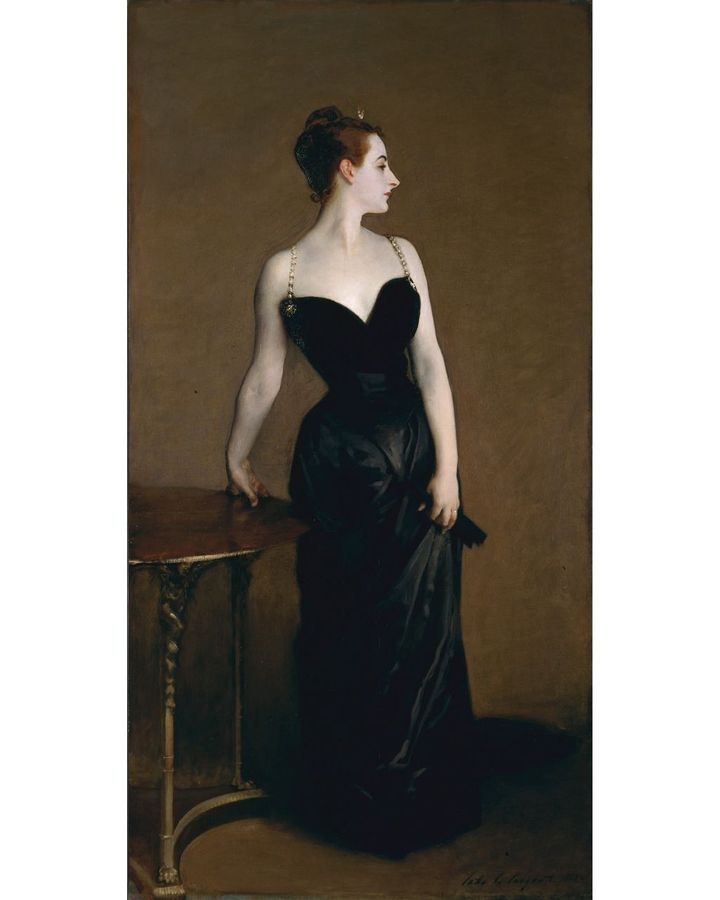
1. Black: Bone black in John Singer Sargent's Madame X (1883-4)
When John Singer Sargent unveiled his portrait of Virginie Amélie Avegno Gautreau, the wife of a French banker, at the Paris salon in 1884, it sparked a scandal. It is said that the artist's decision to let the right strap of her slinky black satin dress slip seductively down her shoulder (a detail he later removed) was more than contemporary eyes could handle. But there is something more than a risqué wardrobe malfunction that unsettles the painting. Sargent has eerily inflected Gautreau's pale skin (which he whipped up from a curious combination of lead white, rose madder, vermillion and viridian) with a pinch of ancient bone black – historically derived from the pulverised remains of incinerated skeletons. The secret ingredient complicates Gautreau's gorgeously gangrenous complexion. Bone black transforms the portrait into a soulful meditation on the fleetingness of flesh, blurring the line between desire and decomposition.
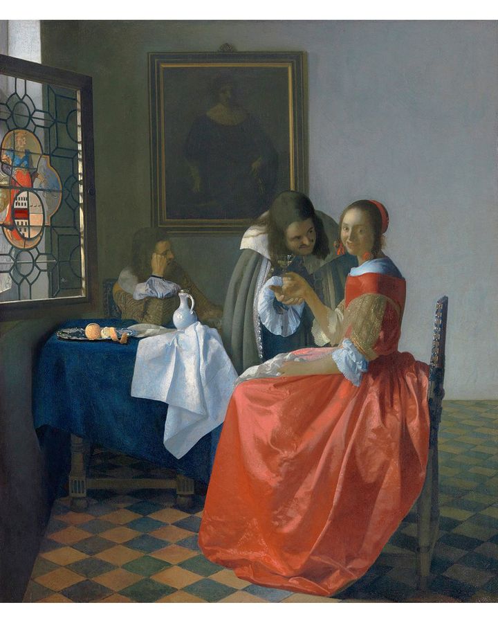
Vermeer's The Girl with a Wine Glass (1659-60) (Credit: Herzog Anton Ulrich-Museum, Claus Cordes)
2. Red: Rose madder in Vermeer's The Girl with a Wine Glass (1659-60)
There is an uncomfortable chemistry between the young woman at the center of Vermeer's painting The Girl with a Wine Glass and her sleazy suitor, whom we see suspiciously sousing her with sips of alcohol while a chaperone nods off in the corner. To intensify the tension, Vermeer has ingeniously soaked his subject's dress in rose madder – a pigment derived from the fiery red roots of the herbaceous perennial plant Rubia tinctorum. Boiled, the roots release an organic compound called alizarin that can be squeezed into a radiant ruby liquor that intoxicates the eye. The lecherous suitor may be doling out the drinks, but the power of the painting pours from her.
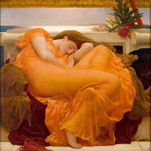
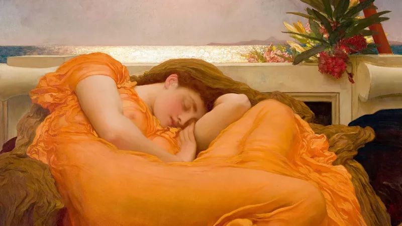
Sir Frederic Leighton's Flaming June (1895) (Credit: Alamy)
3. Orange: Chrome orange in Sir Frederic Leighton's Flaming June (1895)
Sir Frederic Leighton's famous portrait of a slumbering nymph, Flaming June, might appear, at first glance, to epitomize the breeziness of a carefree summer's snooze. For some, the way she slips beneath the level of the horizon that gleams behind her, and the sight of a sprig of lethal oleander within easy reach of her nestled arm introduce themes of death and burial to the seemingly lazy scene. But Leighton has cleverly draped her pliant physique in acres of chrome orange – a relatively new pigment whose production in the 19th Century was made possible by the discovery of vast subterranean deposits near Paris and Baltimore, Maryland, of a deceptively dull and dingy mineral, chromite, that can be alchemized into transcendent radiance. Cloaked in chrome orange, Flaming June is not a mortal about to perish or be buried, but becomes a treasure forever about to be mined – an inextinguishable emblem of endlessly renewable beauty.
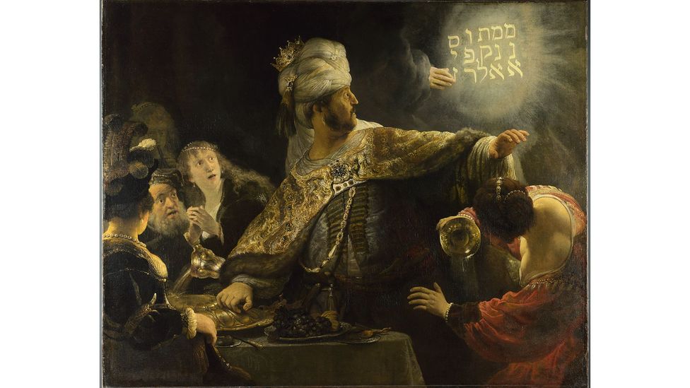
Rembrandt's Belshazzar's Feast, c 1636-38 (Credit: The National Gallery, London)
4. Yellow: Lead-tin yellow in Rembrandt's Belshazzar's Feast, c 1636-38
In 1940, a researcher at the Doerner Institute in Munich hit upon one of the greatest discoveries in art history. It was then that Richard Jacobi succeeded in reverse-engineering the secret recipe for yellow that old masters had once handed down, generation to generation, for centuries, but which had, since the middle of the 18th Century, mysteriously disappeared from paintings without a trace. Jacobi worked out that heating a mixture of lead monoxide and tin dioxide in precise proportions could produce the delicious range of yellows from murky mustard to zesty chiffon that Titian used to illuminate rumpled robes in Bacchus and Ariadne, and that Rembrandt relied upon for the words written by God on the wall of his Belshazzar's Feast.
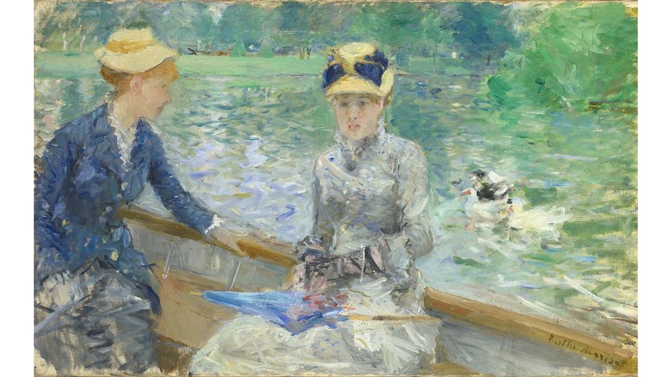
Berthe Morisot's Summer's Day (1879) (Credit: The National Gallery)
5. Green: Emerald green in Berthe Morisot's Summer's Day (1879)
Some suspect that Scheele's Green, a toxic green pigment found in the wallpaper that adorned the exiled Napoleon Bonaparte's bedroom in Saint Helena, might have slowly poisoned him, resulting in his death in 1821. Half a century later, the French painter Berthe Morisot would reach for emerald green, a close cousin of the sinister Scheele's Green, to wallpaper the sky in her painting Summer's Day. Though the work appears to capture a pair of young women in a boat, leisurely adrift on dappled water, there is something disquieting about the air they breathe. Also laced with arsenic, Emerald Green lends an uneasy verdancy to the scene – one that tosses and turns.
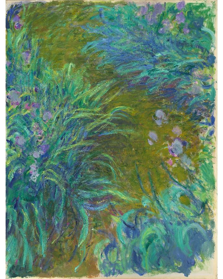
Claude Monet's Irises (1914-1926) (Credit: The National Gallery, London)
6. Purple: Cobalt Violet in Claude Monet's Irises (1914-1926)
Art and luck go hand in hand. A fortunate coincidence in the 19th Century involving the invention of cobalt violet, the first purpose-built purple pigment, and the invention of portable paint tubes that artists could take with them outdoors would prove indispensable for Impressionists keen to capture how shadows fall in nature. "I have finally discovered the true colour of the atmosphere," Édouard Manet would be overheard exclaiming to a group of friends in 1881. "It's violet. Fresh air is violet. I found it! Three years from now everyone will do violet!" Among those who would prove Manet right was Claude Monet, whose paintings of irises and lilies owe their existence to timely invention. Monet's canvases do not merely depict violet. They breathe it.
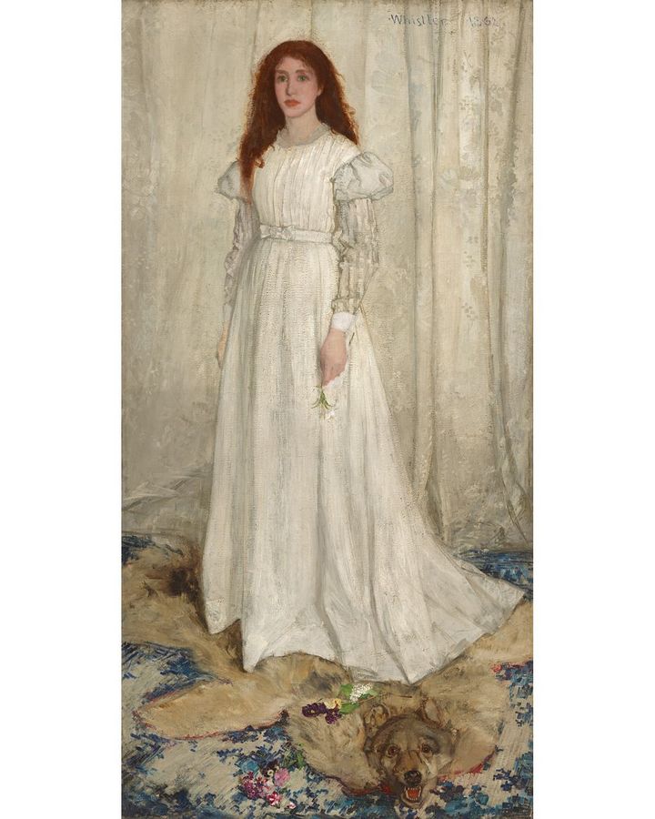
James McNeill Whistler's Symphony in White, No 1: The White Girl (1861-2) (Credit: The National Gallery of Art US)
7. White: Lead white in James McNeill Whistler's Symphony in White, No 1: The White Girl (1861-2)
White has a dark side. Just look at James McNeill Whistler's Symphony in White, No 1: The White Girl, whose very title tries almost too hard with its repetitions of "white" to hide the grubbiness of its making. While the painting may seem an emblem of impeccable purity, it relies on a filthy pigment: lead white. To produce the pigment, strips of lead are placed beside a pool of vinegar for a month in an earthenware chamber, surrounded by piles of fermenting animal excrement. The combination of an acetate, formed by the proximity of lead and vinegar, with the fumes of carbon dioxide emitted by festering feces yielded a puffy white patina on the lead strips that was as alluring as it was lethal. As far back as the 2nd Century, the Greek physician and poet Nicander of Colophon described lead white as a "hateful brew" that could trigger profound neurotoxic effects in those harvesting it. Far from defiling Whistler's work, however, the origin of lead white casts an unexpectedly uplifting light on the painting and suggests what we all hope: that art has the power to transform us, no matter our past, into something beautiful and new.


